We all know how important colors are. They can make us feel calm, relaxed, slower, but they can also make us excited, even nervous or anxious, ecstatic or simply – happy. Managing colors is an underestimated job, but no matter what field you’re in, the importance of being able to mix and match colors, choose the right palette, and more importantly – send the right message to people is one of the essential things when it comes to almost any business out there or any marketplace.
But what is a color scheme anyway? Simply put, this is a combination of colors that is being used for a certain purpose. When it comes to color schemes, the rules are somewhat simple and all that needs to be done is to learn them, in order to be able to choose the right one for any occasion.

Source: uxplanet.org
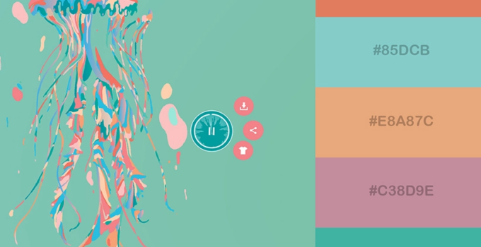
According to many resources, there are 8 color schemes, of which you have probably heard about a couple of them, such as complementary or analogous schemes, while others like triadic are less mentioned or talked about, which most certainly doesn’t make them any less important. If you are an artist, you have had a chance to learn a lot about color schemes in school, but this is also the case with designers of any kind, including web design as well.
What is so special about knowing how to combine and choose colors? A specific selection of colors can make a marketing campaign successful, but it can also ruin it, if the selection is wrong. It can make a fantasy interior of a property, but it can also ruin the interior and make people not wanna spend their time in a space with the wrongly chosen colors. Whichever the case is, the importance of colors can’t be emphasized enough.
It is important to mention that color schemes exist for one reason – to help designers, artists etc create aesthetically pleasing solutions for their projects. Grouping colors in categories of primary or secondary colors should work as a shortcut toward success when it comes to building a brand.

Source: company360.in
We all know that the appearance of almost anything around us (including us) makes a huge impact on our preferences, choices and decisions. It’s interesting to mention that research shows that people need less than a minute to determine if they like something they see, or not. Although elements such as shapes and patterns also make an impact, colors are the number one dealbreaker (or dealmaker).
However, considering the fact that we live in a digital era, everything that we need or that we look for, is usually virtual, or can be found virtually. What do we mean by this? The importance of extraordinary web design solutions has never been so obvious. We are all used to being only one click away from everything we need (and quite often – what we don’t need but still want), and we spend a lot of our time surfing the Internet, looking for things. This is exactly how you can notice the importance of colors. Some websites just invite you to spend a lot of time on them. Others are only a one time visit.
According to inkyy.com, colors are what impacts what kind of message will be sent to the audience, potential clients or potential buyers, since colors are the best way to communicate non verbally. When we see a color, we feel an emotion and this is the core of every campaign, advertisement, product, packaging or anything that you can see around you.
Source: kinsta.com
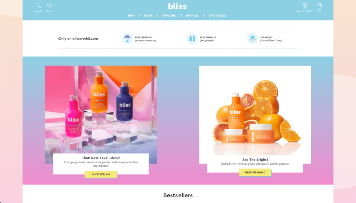
Just imagine going to a supermarket and finding your favorite drink or your favorite snack; the first thing you will look for is the packaging that you linked to your favorite food inside, and you will most certainly look for either colors or logo or both of them combined. That being said, when it comes to web design, colors also help remember products, websites or basically anything. Websites are being made with a goal of staying in people’s minds, so if that’s possible with the use of the right colors, then you’ll understand how color schemes play such a significant role in the process.
In case you didn’t know, black is usually associated with luxury or power while green works amazingly for financial ads or websites, since it has been linked to growth or health. Next time you go to your favorite website, try to analyze the colors you see and you will be able to understand their importance!
Finally, color schemes are crucial for brand development and brand recognition as we already mentioned, but other than that, they also help turning certain business goals into reality. For example, it has been proven that a good call to action button on any website helps people to actually purchase a product or a service.
This is why Call To Action buttons are being tested numerous times before the final version actually stays on the website. The shape, size, color and other elements when it comes to the call to action button are what determines whether a website will be visited and a brand successful – or not.

Source: vizion.com
Also, when you go to a website and see a fantastic offer, you are more likely to do something about it. This is why website designers always try to create a hype about a product, and they can do that by making it urgent, exciting or dynamic. All of that can be done with colors, fonts and shapes, a good layout and many other tricks.
Complementary scheme is a scheme that is made of completely opposite colors, for example blue and yellow. This is usually used somewhere where a big contrast is needed. Monochromatic websites are the ones where there is only one colors and its variables, while analogous colors are usually the nicest option for the human eye, since websites that have a palette like this, consist of colors that are next to each other on the color wheel, which creates a comfortable and enjoyable atmosphere to look at. These are only some of the examples of how designers’ minds work.


